The primary output of this project was a model that predicts the likelihood that a user will lock. Acme Co can then add that prediction to the user's record for employees to consider.
However, I wanted to have a way to display a user's profile relative to other users, and perhaps give some insight into why a user would or wouldn't lock.
I built a python app that displays a user's probability of locking, and graphs that user's features against other users.
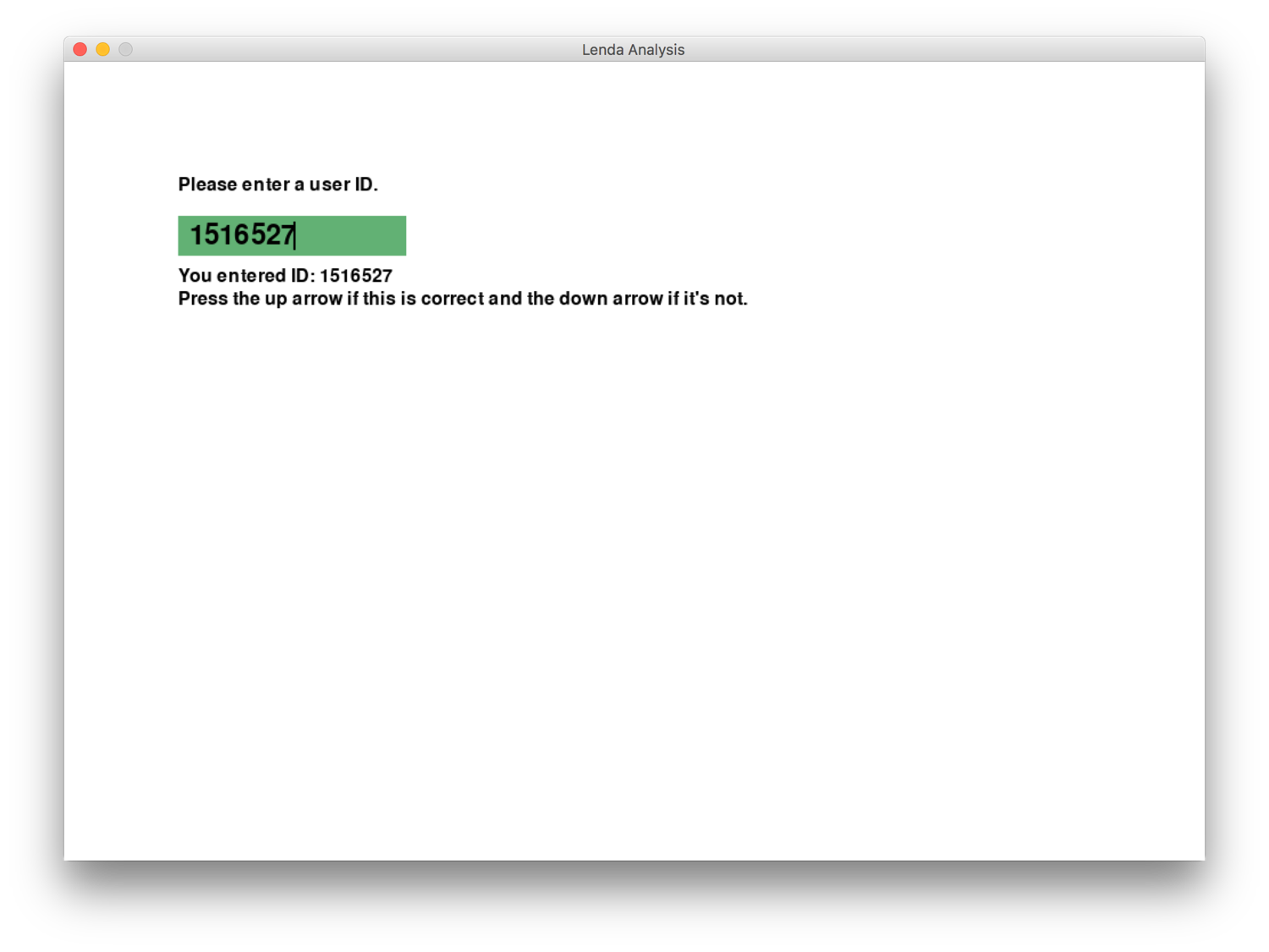
Load screen
Enter a user's unique id
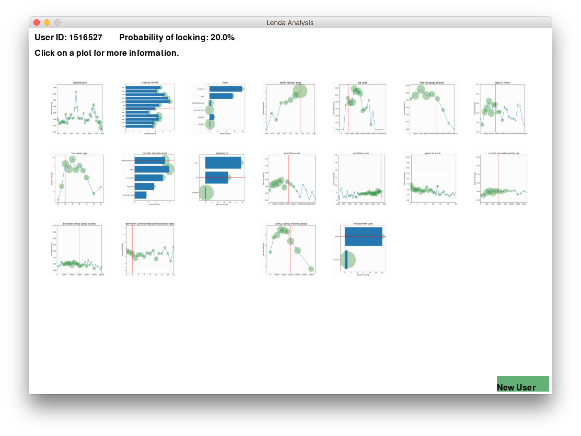
Display
Show graphs of all users with the target user's value marked. A feature is along the x-axis and the percent locking is the y-axis.
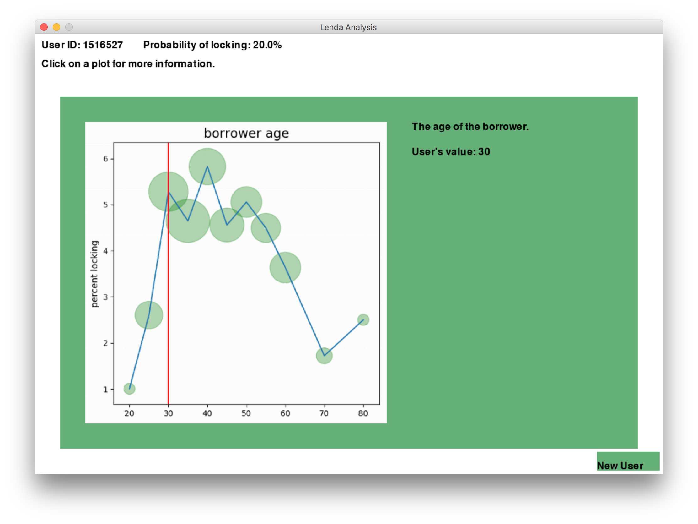
Detail
The graphs are a bit small, so click on one to see it in more detail. This user is 30 years old. Overall, 30 year olds lock about 30% of the time, suggesting that this user may be more likely to lock than most.